UX Writing and Content Strategy – Redesigning Facebook Groups
THE CHALLENGE
Make the sign-up experience of Facebook Groups easier.
THE SOLUTION
Develop strategy, enhance user interface copy and recommend design changes by:
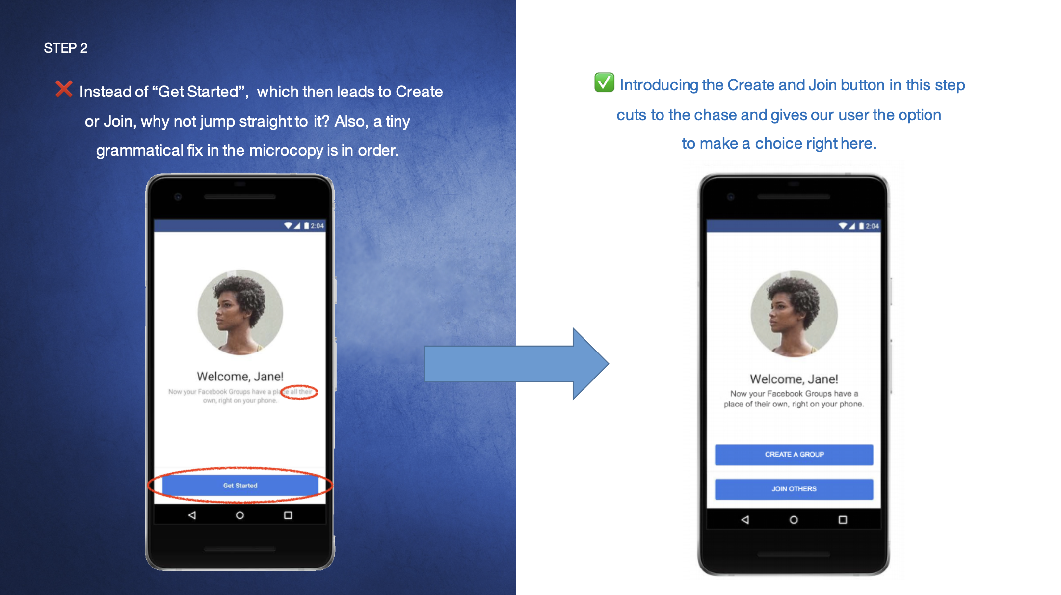
Reconsidering messaging hierarchy and strategy
Restructuring the UX
Refining language and tone
As an experience, Facebook Groups were created for people to join or find people who share their interests and start conversations, post related content, and organise activities with their community. The steps a user has to go through to set up a Group should be fairly uncomplicated and easy to understand, and this exercise was to specifically study the experience, develop content strategy and user interface copy recommendations that would improve this flow. My objective here was to question and shape strategy, enhance the experience through language, voice and tone.
In order to this, I had to break it down first.
If a user comes to Groups, they’ve most likely come with a specific purpose or with a certain interest in mind. Right at the onset then, the sign-up flow for Facebook Groups should be simple, organic, understand your interests/intents, and make suggestions accordingly.
The current user journey although straightforward could do with some fine-tuning. From the moment the app is launched to the sequence of the steps, rethinking the order of what’s relevant for the user, filling the gaps, and also refining the user interface copy can make the whole experience more user centric, giving the user more clarity and control.
POINTS TO CONSIDER
• Why would people use this app? How does it help them?
• What do people want from it? What do they need?
• What are their possible issues or concerns?
• Is there a certain age/demographic for our target user? Should we be identifying who they are, where they’re coming from, their interests, etc. before we take them to create their own Group or join one?
• Typically, what problems have people faced when creating Groups in the past, if any? Have there been fallouts, where people don’t go all the way through to create the Group because of a gap or step that makes them lose interest and not complete the process?
• Are any particular steps within the process causing a higher than normal fallout?
• What insights can I gather from the Designers, UX Researchers, Developers, Data Scientists, Product Managers, and other stake holders/creators involved in this process?
• Do certain steps need additional optimisation to enhance the mobile experience and encourage conversion?
SUMMARY
From the understanding that the app was built for people, individuals and businesses, to create Groups of their own which supports their interests, and gives them the ability to invite people and share content together, the user journey will have to be such that it lets them do just that in the easiest way and in as less time as possible.
RETHINK. REDESIGN.


